Overview
My role was UX designer leading the app and responsive website design from conception to delivery. During this project, I conducted interviews, paper and digital wireframing, low and high-fidelity prototyping, usability studies, accounting for accessibility, iterating on designs, determining information architecture, and responsive design.
Problem
Outdoor Renewal is an online shop that sells stickers and magnets for nature lovers and outdoorsy folks. The company donates part of the proceeds to fight climate change. They currently are selling on Esty but wanted an app and website of their own.
Solution
I worked with Outdoor Renewal's founder to design an app and responsive website that they can sell directly through as well as more information to the customers about the donations. They don't currently have the budget for engineering, but they are keeping my designs on file for when they raise enough money. 
Process
User Research
I interviewed friends and other potential users that were into outdoor activities. The consensus was that people really want to do more to combat climate change, but they don’t know how they can help. Most loved the idea of outdoor renewal and said they would buy from the app. When asked what they would like to see on the app they said they would want to see where the profits are going and know the backstory of each piece.
Sketches
Wireframes & Prototypes
Usability Study
I conducted an unmoderated usability study with 5 participants using the low-fi prototype. They were given a list of tasks to complete and then answered a short questionnaire.  
Major Design Iterations
Iteration #1

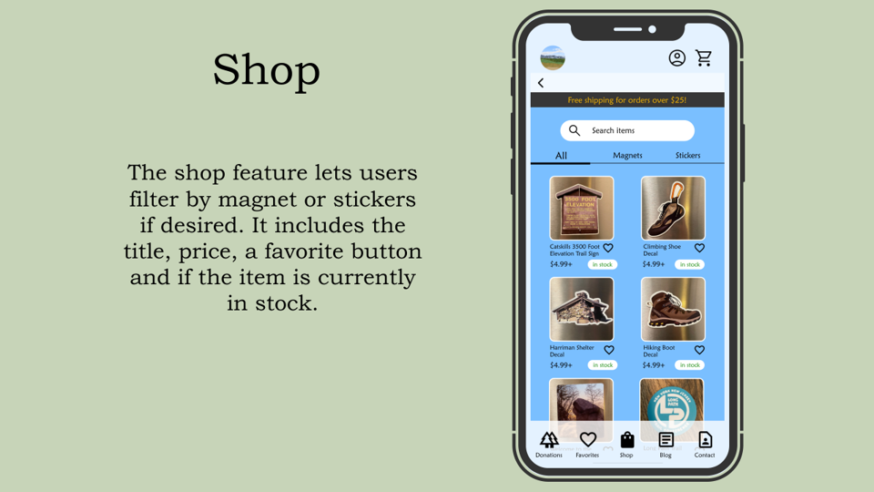
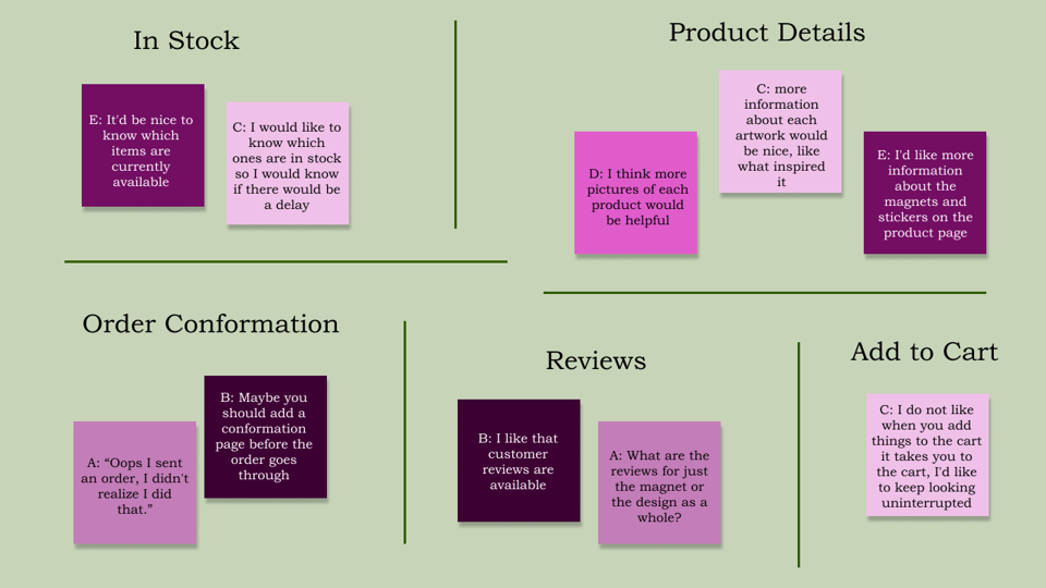
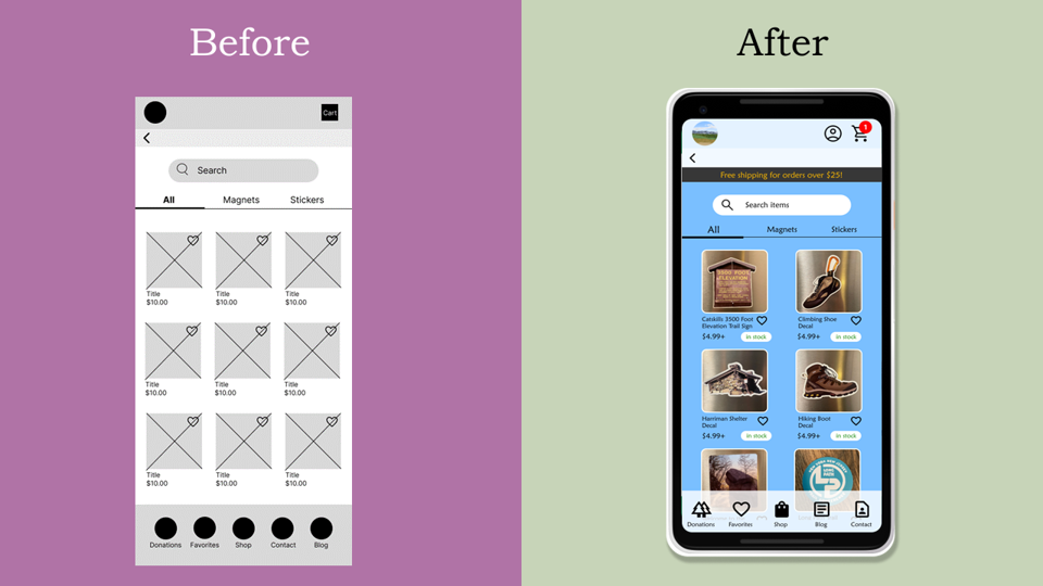
Users didn't like that when they added an item to the cart, it would take them to the cart so I added a red number on the cart. I made it bright red to be easily visible and memorable. I also added an icon for items that were in stock or out of stock, so users would know which items could be delayed if they ordered.

Iteration #2

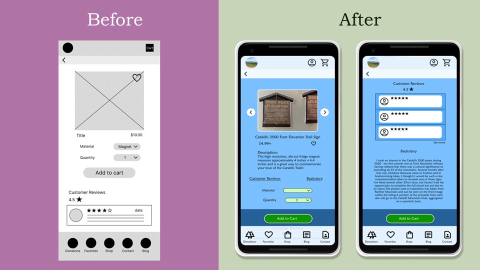
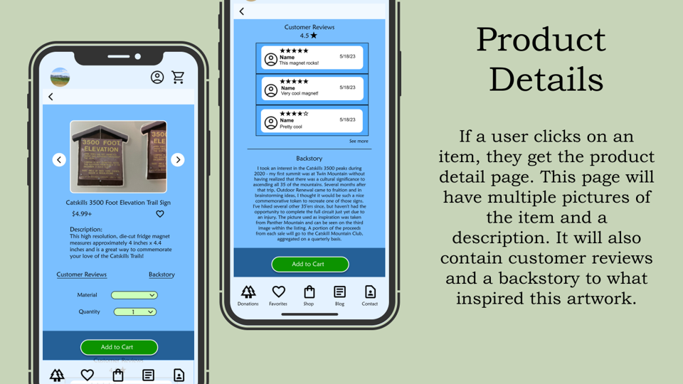
Over 50% of users in the study wanted more information on the product detail page. I added more photos of the item to give users a better idea of what they would be purchasing and a written description. The customer reviews and backstory of the art are at the bottom of the page. I added links under the description that scroll to the corresponding section.  

Iteration #3

Multiple users were surprised that they made a purchase after pressing the place order button on the checkout page. I added a confirmation page before the order goes through so no users feel tricked into purchasing.

Final Designs
Responsive Website
High Fidelity Prototypes
App
Website
Takeaways
 Users were excited to buy these magnets and stickers and share their love of the planet while knowing the money was going to a great cause. Climate change is a huge problem, outdoor renewal can’t solve it alone but every little bit is helping!
I learned that most users want more authenticity and personalization from companies. Especially if the money is going to a cause, users want to know why that cause is important to the founder. 
Back to Top